
Showing posts with label BRIEF2 context. Show all posts
Showing posts with label BRIEF2 context. Show all posts
Wednesday, 29 May 2013

Wednesday, 27 February 2013
Brief 2 - Bunch Design, Found
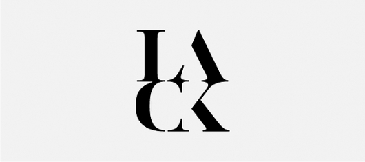
Not a fan of the colour scheme but I what stood out for me is what isn't actually there. The breaks in the characters forced you eye to fill in the space where the serifs should connect to the rest of the letterform. Again its another minimal bit of typographic inspiration for my practice in this brief.

Tuesday, 22 January 2013
BRIEF 2 - Thinking form // George Staehelin IS logo
Found this logo which could easily represent SO HOMME itself. It using the minimal shape and forms in the letters I and S to create the full logo. Not much else to comment on this project as all thats available is an image of the logo. Things like this interest me still, even without a background to a project the visuals speak to me and inspire me to try things.


BRIEF 2 // BRIEF 4 - Anagrama / MTLL
This branding project by Anagrama has intrigued me, with its minimal, type based logo. It use the space to make the eye work and creates an abstract visual on first glance, which relates to my experimental design direction for SO HOMME.
The notebook uses an interesting sting winding mechanism which could be incorporated into the SO HOMME logo if it was to be placed where the full stop is. An experimental idea which may not work as well as a simpler one but I'm going to try it.
Furthermore, the card board tube deliverable would make a great addition for Thierry's branded range as he could us it to carry different sized prints for exhibitions of his work and for general transportation.
The logo also has a great impact about it which Thierry has expressed he would like in his branding, although I'm taking a more 'to the point' approach to the design work for that brief.


The notebook uses an interesting sting winding mechanism which could be incorporated into the SO HOMME logo if it was to be placed where the full stop is. An experimental idea which may not work as well as a simpler one but I'm going to try it.
Furthermore, the card board tube deliverable would make a great addition for Thierry's branded range as he could us it to carry different sized prints for exhibitions of his work and for general transportation.
The logo also has a great impact about it which Thierry has expressed he would like in his branding, although I'm taking a more 'to the point' approach to the design work for that brief.


BRIEF 2 - LookBook // Hellome-Umali
This is a repost from my Design Context blog for this brief. I began blogging my contextual findings before the Christmas break and now I'm shifting the content over to My FMP blog. The original blog posts were titled 'SS' for Shaun Somerville as at that point he hadn't decided to name the brand SO HOMME. I've retitled these reposts so they coincide with the rest of them that are specific to BRIEF 2.


BRIEF 2 - Raf Simons concept video
This is a repost from my Design Context blog for this brief. I began blogging my contextual findings before the Christmas break and now I'm shifting the content over to My FMP blog. The original blog posts were titled 'SS' for Shaun Somerville as at that point he hadn't decided to name the brand SO HOMME. I've retitled these reposts so they coincide with the rest of them that are specific to BRIEF 2.
RAF SIMONS SS 13 from 254⚡FOREST on Vimeo.
BRIEF 2 - Minimalist typography search
This is a repost from my Design Context blog for this brief. I began blogging my contextual findings before the Christmas break and now I'm shifting the content over to My FMP blog. The original blog posts were titled 'SS' for Shaun Somerville as at that point he hadn't decided to name the brand SO HOMME. I've retitled these reposts so they coincide with the rest of them that are specific to BRIEF 2.

http://abbreviatedexperienceproject.wordpress.com/2011/11/22/minimalist-typeface-inspiration/
http://www.typographyserved.com/gallery/Casanova-Typeface/2328808

http://adbrad.wordpress.com/2008/10/

http://www.typographyserved.com/gallery/Casanova-Typeface/2328808

BRIEF 2 - Fashion typography
This is a repost from my Design Context blog for this brief. I began blogging my contextual findings before the Christmas break and now I'm shifting the content over to My FMP blog. The original blog posts were titled 'SS' for Shaun Somerville as at that point he hadn't decided to name the brand SO HOMME. I've retitled these reposts so they coincide with the rest of them that are specific to BRIEF 2.

VILLA


LACK logo design on Behance network.
BRIEF 2 - Competitors
This is a repost from my Design Context blog for this brief. I began blogging my contextual findings before the Christmas break and now I'm shifting the content over to My FMP blog. The original blog posts were titled 'SS' for Shaun Somerville as at that point he hadn't decided to name the brand SO HOMME. I've retitled these reposts so they coincide with the rest of them that are specific to BRIEF 2.
I've been looking into the competitors and influences Shaun has left with me to research. There is some good stuff and the majority of it is very minimal which is something Shaun is going for. The creative challenge with being minimal is saying a lot with not very much.
Jil Sanders.
http://www.jilsander.com/men.html


I've been looking into the competitors and influences Shaun has left with me to research. There is some good stuff and the majority of it is very minimal which is something Shaun is going for. The creative challenge with being minimal is saying a lot with not very much.
Jil Sanders.
http://www.jilsander.com/men.html


Raf Simons.
Very interesting and avant gard website. His approach is quite impactive and unconventional as well as minimal. The design work incorporates concept videos and music as well as the collections.


ACNE.


Comme Des Garçons.
Very unusual website for this one. The navigation is difficult to understand and its not very user friendly. It's more of an art compilation and mood site than an actual exhibition of fashion. From my understanding of fashion and through discussions with Shaun and Paul Luke I've learnt that there is more to fashion design than just creating clothes and designing them. It's a lot about aesthetics and trends which are influenced from a number of different things world wide. Trends are also predicted and foreseen based on sociology, economics, ecology, politics and psychology.


Dover Street Market.
This website actually has all of Comme Des Garçons collections.


Monday, 21 January 2013

BRIEF 2 - Kinderscout branding
Found this subtle and crisp bit of branding which I like for the letter K alone. The simple idea of just taking away a section of the character and letting the eye fill in the blank has been used well.


BRIEF 2 - Simple swing tag//a boy in mid air blog
Came across this tumblr blog which posts about simplicity in design and art direction. These swing tags are elegant, minimal and bold.

Following a link to another blogger who posted this image I found this design blog with is mostly images and photographs but it has many other interesting and inspiring design work which may relate to some of my other briefs.

I like this bold logo because even with its elegance it retains the masculinity I'm aiming to achieve with the SO HOMME logo.
BRIEF 2 - Typographic Architect
This design studio under took a job that created some very typographic exhibition work and made a publication about it. The work I'm doing for this brief is going to me mostly typographic and experimental like the anamorphic typography used in the exhibition.


BRIEF 2 - Art deco typeface by Moshik Nadav
Moshik Nadav is on the Behance network and I discovered his work through the designspiration webpage. I really like the way he's made use of bold shapes and thin lines to form the characters of this typeface.


BRIEF 2 - Les Graphiquants
Les Graphiquants is a French design page with some really stunning typefaces, the shapes and forms are elegant and minimal which is what intend to achieve with my designs for Shaun. The letters provide opportunities for really interesting layouts and imagery constructed from the type. As I'm going to be quite experimental with this project I want to try different things and bring myself out of my comfort zone with the design work.


Sunday, 20 January 2013
FMP proposal prep form.
This is my revised prep form. I've got a slightly better understanding of how to write these forms now. I found it helpful for defining my FMP proposal but now I have to apply it to the SOI which seems like I'm repeating myself.
Wednesday, 16 January 2013
BRIEF 2 - SO HOMME statement of intent
This is the statement of intent which Shaun had to produce along with the research portfolio for his hand in. Much like the SOI for my own FMP it underlines everything He is aiming for and hoping to achieve and how he is going to do it. Again this is a useful for me to look through and reference as it will affect some of the decisions I will make for this brief.
<div data-configid="3626884/1142793" style="width: 525px; height: 371px;" class="issuuembed"></div><script type="text/javascript" src="//e.issuu.com/embed.js" async="true"></script>
BRIEF 2 - SO HOMME research portfolio
This is Shaun's research portfolio which was part of his recent had in. It's a good reference for my to get some direct research and inspiration for the design of his branding. It covers a lot of areas Shaun has looked into and it's very much directed in the ways of looking at trends and developing his own work. I'm looking through this to try and grasp at the design influences and then transfer those influences across to a graphic response.
<div data-configid="3626884/1142749" style="width: 525px; height: 371px;" class="issuuembed"></div><script type="text/javascript" src="//e.issuu.com/embed.js" async="true"></script>
Subscribe to:
Posts (Atom)